
RECENT VANGUARD ACQUISITIONS
This was the title of an exhibition at the Art Gallery of Ontario installed just before I left Toronto to create the Art History Department at the Nova Scotia College of Art and Design. The idea was to show works I had acquired for the A.G.O. during the previous five years.
As in the case of the exhibition 49th Parallels, I thought it worthwhile to begin the catalogue essay with a general introduction—this time one that dwelt on the social, financial and practical matters with which the curator of contemporary art had, and still has, to cope. The introduction is followed by what, in the profession, are called “justifications” for such acquisitions.
INTRODUCTION
To legitimize the collection of vanguard art for an average museum visitor is a formidable undertaking, and even a quixotic one if we are to believe the findings of a recent UNESCO enquiry.(1) This study, which investigated public attitudes towards Modern Art, revealed that, although such art was increasingly looked at, it was for the most part neither liked nor understood—a conclusion obtained entirely without reference to the narrower and more challenging compass of the current avant-garde.
The fact that this result was obtained in Toronto in 1967 might make it grounds for particular anguish, except one suspects that Toronto is not unique in its prejudices. Moreover, some observations can be made in its mitigation. The category of experience called “art,” for instance, seems not to be a conjunctive one but rather a category into which society has placed quite disparate transactions.(2) Furthermore, while we retain this category (as against a more general category like “play”), the election of events or objects to it is necessarily a convention, involves learnable attitudes towards experience and is subject, one supposes, to the laws of learning theory, drive satisfaction, intrinsic and extrinsic rewards and so on. More important, as the rate increases at which new art-learning schedules are proffered, only a minimum number of people are able to devote the energy necessary to keep up with them. In consequence, a time lag between radical artists and the public is inevitable – a matter of psychic economy more than taste (though the latter may develop on the heels of the former).
On the other hand, although the vanguard artist is pushed by inexorable forces—social, psychological or philosophical—towards his radical position, and has a natural bias towards ignoring the certainty of alienation, his emotional energy might be saved if he bowed to its inevitability. Even in the event of much greater exposure than he currently receives, popular acceptance can be a lengthy process. To be exemplary is to be lonely and, at best, he will communicate only to an informed minority.
At the same time, there are insights which might be therapeutic for those outside that minority. The present, for instance, is distorted by an ignorance of the past. Those unaware of history suffer a special hubris: they think themselves uniquely burdened. But misunderstanding of innovation is not unique only today—it occurred when art was integrated into the bourgeois or even the courtly social structure; and it is at least a hundred years since the problems of vanguardism became endemic. Indeed, the decade between 1904 and 1914 saw a pace of innovation almost as rapid as that of today, and it is ironic that the many “isms” born then should by now have influenced, often through a process of travesty, all aspects of our visual culture, while the original works themselves are still largely rejected in the democratic West and actually suffered banishment in Hitler’s Germany and Stalin’s Russia. The fact, however, that they are accepted and understood by most art students who make an effort, should persuade us that such rejection, though inevitable in today’s society, is a public loss.
But today’s young artists have a further problem: the discoveries in visual expression of sixty years ago occurred in a mosaic of cities across Europe from Moscow to Rome, whereas today they tend to emerge from, or are legitimized by, a single locale. “Significant” information flows not through a network with many independent sources but radiates from a centre (New York) to a periphery—and not to live at the centre is to suffer significant disadvantages. For instance, one’s existence goes unacknowledged, yet the subtleties of the innovative life cannot be caught without a special kind of feedback which today takes place only in the infrastructure of the centre itself (amusingly enough by the medieval technology of studio gossip and tireless route marches from one end of Manhattan to the other). The inhibitory effect of a centre-periphery system on those not at the centre is particularly difficult to overcome, and there are only very recently indications that a new communications pattern could emerge.(3) Should it do so, the rate of significant innovation outside New York will certainly increase.
A word must also be said about the policy of museums that espouse the avant-garde. This affiliation is both ideological and pragmatic. On the one hand, museums represent the visible articulation of public faith in the artist as Shelley’s “unacknowledged legislator of the world” and, on the other, the market for art is expanding (pace the UNESCO study), while the growing dearth of those old masters shaken out of Europe by the turbulence of the first half of the century makes contemporary art by far the largest pool of un-acquired works. More important, historical precedent insists that the new artists of today will be the old masters of tomorrow, and the challenge to discover them is too strong to be ignored in the light of a highly volatile market (rising prices spiral along with increased attention—so that new art appreciates more rapidly today than in the past). One of the museum’s tasks in this context, therefore, is to tune its sensitivity to the most fruitful innovative thrusts of the time and from their domain to assemble works as best it can, by purchase and by eliciting gifts. It is the result of such a policy at the Art Gallery of Ontario, over the last five years, that forms the substance of this exhibition.(4)
To some degree the exhibition is therefore bound to lack coherence. Individual items can represent the tying of ends left from an earlier era or may anticipate future policy, while others are gifts which do not always merge with the main stream—and the gaps in any modestly budgeted collection will always be numerous. On the other hand, a work of art should be seen for itself and not as representative of the larger whole—in which light the curator’s dilemma of whether to build on strengths or to fill gaps becomes a rather academic exercise. In this respect, too, to write about art is also to risk diminishing its status: the writer produces the map of an aesthetic terrain and tries to locate its salient topography, but because the map is so much more available than the art, it is the map which can take on the greater reality – the works themselves becoming merely validations of it. Readers about to embark on the following paragraphs therefore should return often to the works, to make their own assessments, even at the expense of what is written.
As the exhibition shows, the main concern of recent acquisition policy at the Art Gallery of Ontario has been sculpture. This has been partly because paintings representative of the first part of the ’60s decade were acquired earlier, but more significantly because the mid and later sixties witnessed an unprecedented blossoming of three dimensional art.
Such a development was one outcome of a sensibility then widely dominant, not only in the visual arts but in the literary and performing arts as well—and in keen contrast to the emotionally more indulgent fifties—a sensibility characterized by the preference for intellection over feeling and which tried even to separate perception from cognition: to present the barest possible art datum. Philosophically, it found common cause with both the phenomenological wing of existentialism and linguistic theories, but once a direction was established in the visual arts it was fuelled by an inexorable logic of its own. For instance, an attempt to eliminate those factors in painting which overlapped with other arts was pushed so far as to exclude even elements unique to it, like spatial illusion—with the result that some paintings took on the aspect of three ¬dimensional wall objects. This gave the cue for certain artists to renounce painting altogether in favour not of sculpture but of a hypothetical art form located between the two (Donald Judd, for instance, whose untitled work is represented in the exhibition, once said, “Everything that sculpture and painting have, my work doesn’t”).(5)
In some way, the drive to realize such a concept (at times referred to as “minimal” art) informs much of the exhibition, but it is found particularly in the Wood Gallery, where the works, including the David Smith steel circle, all aim at that totally lucid simplicity which the period came at least partially to demand. The Smith (“Untitled, stainless steel circle,” 1962) is found here, however, more because of its sympathy with other pieces than because the artist stood on the same theoretical ground. Nevertheless, although the earliest sculpture in the exhibition (and significantly the only one presented on a stand), it exists as an important augury of things to come—for if we see the stand as a functional method to elevate the circle, then the circle becomes, from one point of view, a painting in steel- the only “non-relational” unitary composition that Smith created.
Donald Judd and Sol LeWitt
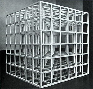
Donald Judd, quoted above (whose critical writings often read like a passage from the French novelists who brought the aesthetic of simplification into literature) is represented by a work composed of three equal modules which rely on the reflective, refractive and transparent properties of the materials used, and on the particular way in which they are presented to the viewer—on a wall, like a painting, yet firmly material, even as they generate illusions. Sol LeWitt’s “Untitled (open modular cube)” of 1966, however, avoids Judd’s gently emphasized materials and volumetric bias in favour of a bare formal structure—absolutely lucid because absolutely modular and repetitive—and yet this simple formula produces the most astonishing visual excitement. It does so, however, gratuitously: LeWitt once wrote, “The idea becomes a machine that makes the art.,”(6) implying that the visual effect is contingent with the structure but not with the inspiration for it. In this, the present sculpture parallels some recent black and white graphics of the artist which, because of their particular distribution of line, generate colour responses in the retina. His ink drawing in the graphics section has no such overtone, however, and remains, like much of his sculpture, pristine, innocent and austere—a rare and dry visual vintage.
Dan Flavin and Douglas Wheeler
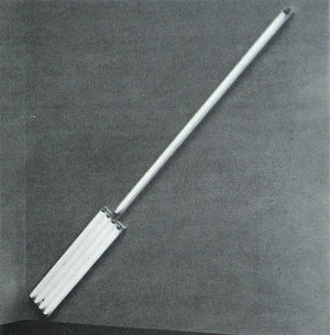
Dan Flavin, whose fluorescent light work of 1964 also appears in this gallery, shows an evident sympathy with LeWitt and Judd, and underlines the fact by dedicating to Judd a work whose medium places it neatly in the area, between painting and sculpture, that Judd so tersely defined. One might say the same thing of the suffusive light of Douglas Wheeler’s, work, except that his output, like that of John McCracken’s, also takes something from the ambience of Los Angeles, in which it originates.
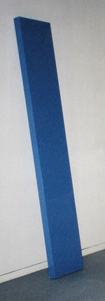
McCracken’s “Violet Plank” (1971) stands at the end of a series of carefully argued visual statements (as visitors to his 1969 exhibition at the Art Gallery of Ontario will recall). Yet, at the same time, one perceives in its nonchalant pose and gorgeous surface, a keen sense of locale: the rich finish of the California “Kustom Kar,” for instance, and even a reference to body imagery (the lithe, incipient tautness of the surfer). And if, in this way, McCracken’s work seems referential, so does Wheeler’s. No-one who has experienced the curiously mellowed patina of the disused windows of the Los Angeles artists’ suburb of Venice, can avoid associating it with Wheeler’s lambent work.
The one Canadian in this gallery, Ronald Bloore, is engaged with a different simplicity, as if he were a sophisticated tribal craftsman translating fleshly scarification into high art. Like other works, however, his also eliminate formal complexity and relational colours, and take identity (neither painting nor sculpture) as a sort of refined “primitive” relief. But Bloore’s unique concern for facture (the way he leaves evidence of his hand’s activity in the surface of the work) links him not only to the art of primitive cultures but to the tradition established by impressionism and brought down to us by a whole line of artists to the present day.
In the Leonard Rotunda, other Canadians continue, in profoundly different ways, the same preoccupation with “phenomenological reduction,” as it has been called. Peter Kolisnyk, for instance, is probably the only artist to have produced free-standing canvases within such an aesthetic—a surprising fact when one considers the spirit of the times. The work, composed of three canvases, which represents him here [see a photo of a similar piece in the 49th Parallels essay], characteristically melds real with illusionary space, and sculptural, with two dimensional form—preoccupations which have led him to considerable achievements since.
With rather different aims, Greg Curnoe and Ron Martin generate paintings with even more ideational procedures, a strategy which, like LeWitt’s in sculpture, minimizes the question of choice and “taste” on the artist’s part. Curnoe’s aims, perhaps more associated with European “Lettrism” and his own earlier brand of autobiographical “pop” art, lead him to print verbal descriptions of the landscape beyond his window; but the result seems nevertheless a solution to a reductionist problem, and although it takes on “painterly” qualities through the imperfect impression of the stamped letters, it also reminds us, like Judd’s criticism, of the descriptive French novels already referred to. Martin, working on a modular grid, gains a similar painterly quality by pre-ordaining his colour sequences and “painting out” each loaded brush (one stroke for each module) until the paint is exhausted—then reloading the brush to continue. These factors, controlled chance and the frayed-out brush mark, unite in Martin’s work to produce a sophisticated comment on Abstract Expressionism, while brilliantly eschewing its more obvious devices.
Paul Fournier, Bruce Parsons and Henry Saxe stand apart. Fournier and Parsons share something with artists who have recently developed a lyrical version of fifties art, though more than most they bring to their work newly available techniques and materials. This latter observation is true of Saxe too, though the formal basis of his work is a single repeated module—for reasons similar to those of artists already mentioned. Saxe, however, takes a modular system to produce a knotted complexity of form (which his later work has developed to mind-boggling degree).
The wide range of ends that can be pursued through the use of modular means, is further demonstrated in the Sculpture Court, where one can find works by Ed Zelenak [photo in the “49th Parallels” essay] and Robert Downing, along with sculpture by Walter Redinger. Zelenak, for instance, turns out to use a type of modular unit, but although his turgid, erogenous forms are nothing if not “knotted,” his position is far from that of Saxe’s. Indeed, Zelenak and Redinger are unique in the exhibition in their barely sublimated references to visceral sensation and their emphasis on psychological impact. In this respect they may be said to relate to a genre known as “funk” art, which appeared particularly in San Francisco earlier in the decade. However, today, these themes are more muted, and their recent work in both cases has taken on a monumental aspect.
The sculpture of Robert Downing’s, one of the two Canadian artists to have had a one-man exhibition at London’s Whitechapel Gallery, aims in contrast for a cool and measured poise, his “Corners Related” (1968) belonging among a series of sculptures derived from that simplest of geometric solids, the cube. In this respect he shares something with the “minimalists,” as he does when generating his forms by dissecting the cube across its many axes and reconstituting it, as here, in predetermined configurations—always with an exquisite care for the value of surface (in which he compares favourably with McCracken or Judd). Unlike the minimalists, however, Downing has been willing to let cabalistic overtones exist in his work, and most recently has moved nearer to the iconography of “cosmic consciousness”—a decision, incidentally, also taken by McCracken.
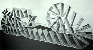
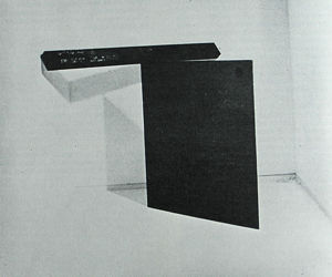
Perhaps the most seminal work among these vanguard acquisitions, however, is to be found in the Leonard Gallery. This is the sculpture titled “Redan”(7) by the American artist Carl Andre. Planned in the fall of 1964 and first shown at the Tibor de Nagy Gallery in New York in January 1965, this work (its title refers to a fortification with faces forming salient angles) represents the first truly ground-hugging sculpture in the corpus of Western art (notwithstanding Brancusi’s “Bench” of 1917 or the fact that just previously Donald Judd and Robert Morris had created box-like and slab-like forms more horizontal than vertical).
In “Redan,” furthermore, Andre succeeded in creating a sculpture as pregnant with possibilities as Picasso’s “Demoiselles d’Avignon.” Fascinated by Brancusi’s “Endless Column,” he had as early as 1960 pre-figured other artists’ use of modular units, in a number of vertically stacked sculptures, and in “Redan” he used this modular principle to construct a work in which, in his words, he “put Brancusi’s “Endless Column” on the ground instead of in the air.”(8) At the same time, “Redan” ushered into sculpture the idea of a work made by the stacking and abutting of modular units, and composed of the raw material of the woodyard untouched by the artist and bearing the brute imprint of the saw; a piece furthermore which can be reassembled from an idea—using new material at any new site. It was these innovations which led to the “floor sculpture” of the rest of the decade, including Andre’s own, to the many works made by abutting unit materials, and to a great corpus of work predicated on the process of its own realization or the brute authority of its material presence. At the same time, however, this sculpture must be seen in its own right and not as merely a signpost. One is meant to feel the agreeable quality of the stacking and abutting, the curious taming that happens to the gross material, the strange formal implications of a work which might be “endless” yet conceivable, the gravity of the mass, its at once squat yet snake-like contact with the ground and the space through which it cuts.
The debt to Andre of Richard Serra’s “Untitled (steel corner prop)” of 1970, is remote, even if it exists. Certainly in Serra’s work more original factors enter. The work is about “propping” (not abutting or stacking) and its size is limited by the weight of the material. The bar weighs 400 pounds and presents nerve-racking problems of installation—which are part of its appeal. On the one hand it seems precarious, the mechanics of its propping are difficult to grasp, and even though the piece is stable when installed, it radiates a drama in which the bar, in process of falling, has been arrested, but arrested by factors which, considering the massive weight, are difficult to comprehend and which serve in fact reciprocally to support the steel plate itself. The point at which these massive forces are held in equilibrium focuses our attention on the means by which the equilibrium is achieved.
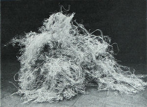
Alan Saret’s sculpture, made of galvanized chicken wire, in contrast, can be totally nonchalant. The specially cut wire is piled and bundled to show off the spatial etching and highlighting of which it is capable. The casual piling underscores this filigree beauty, yet our usual association with the workaday coarseness of the material prevents the work from becoming merely pretty. It will be obvious that both Serra and Saret represent a step beyond the works found in the Wood Gallery, with their even greater extreme of non-involvement of the artist, paralleled by an even keener focus on the material and the process used.(9)
Karl Beveridge’s sculpture “869-231” (1969) seems to stand somewhere between Andre, Serra and Saret [see a photo in the “49th Parallels” essay]. Beveridge’s sensibility unites here the seeming fragility of expanded steel with the forthright stabilizing weight of rough timber: a juxtaposition whose poignancy the former artists would avoid but which in many works is Beveridge’s strength. This poetry of the scrap-yard, defining subtleties of spatial thrust and gesture, whilst placing the materials in mutual dependence, has been characteristic of the artist’s best work in recent years.
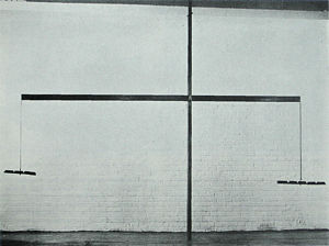
Michael Snow’s sculpture “Aluminum and Lead” (1968) is predicated on “balance”, just as Serra’s work is predicated on “prop.” It is significant, however, that Snow does not use the word “balance” in his title, as if to emphasize to us that the drama we find in the Serra has been eschewed. For, although this work uses the possibility of balance, it is about something more metaphysical. Where the “minimalists” realized or mediated an idea pared down as far as possible to a single sense-datum or module, where Saret goes further and mediates nothing, merely presenting material, or where Serra presents us with “the way the material is presented,” Snow asks whether it is possible to construct an object which expresses only a resonant and emphatic self- reference: and has seen that this is possible by presenting two forces in equilibrium. In the present work, through the equation of unequal lead ingots by the balance bar, these forces refer back constantly to each other. Snow has made a number of pieces in which such an inter-play or “short-circuit” (the name of one of them) gives the work its closed-off, tautological air. Here he manifests the idea in a structure whose gangling inelegance and “dumb” internal reflexiveness are profoundly amusing.
In the context of these sculptors, the “Untitled,” blue-grey painting, of 1969, by David Diao finds ready sympathy. For Diao, in turn, seems to aim at a painting devoid of all reference except the process of its own making. Hence it is monochrome, hence he initially uses a stretcher whose bars will leave an imprint on the canvas as he works, and he supports the canvas from below with common bricks whose image will also remain when the work is finished. Then he takes a thick acrylic paint and begins a process of clearing it from the canvas with a squeegee. Afterwards the painting is re-stretched so that the canvas remains clear of the original stretcher bars. Thus the main function of the work is as an index of the painter’s action, and this work, more than any other, demonstrates the debt, however remote, these later artists have to the work of Jackson Pollock’s of the late forties. It is Diao’s simplifications, however, that place him in the late sixies, parallel to, but not really of, the lyrical abstractionists represented by Fournier. But overlaying his aim to have the canvas as an index of his activity, he cannot avoid presenting us with certain atavistic satisfactions, somewhat like the satisfaction one gets from taking a squeegee to a sudsy surface on the floor of the kitchen.
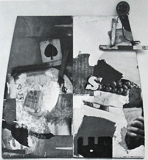
Elsewhere in the Leonard Gallery we find two painters within a very different aesthetic: Robert Rauschenberg and James Rosenquist, whose debts are ultimately to Cubist and Dadaist collage and who here draw on the imagery of billboards and advertisements. This involvement with commonplace subject matter was typical of the early sixties and links them with artists like Oldenburg, Segal, Dine, Indiana and Warhol, already represented in the collection. Indeed, the splashed and dribbled paint in Rauschenberg’s “Story” reminds us that he bridged the gap between abstract expressionism and these very “pop” artists. Besides his obvious antecedents, however, Rauschenberg owes something of a more theoretical nature to the example of the composer John Cage—who has tried to persuade us that the ordinary, unaltered sounds of the world can be music, and whose phrase, “Beauty is now underfoot whenever we take the trouble to look,”(10) was written with Rauschenberg’s paintings in mind. It was Cage who, in 1955. introduced Rauschenberg to Merce Cunningham, the dancer and choreographer, and established a partnership which led, six years later, to a European tour, during which Rauschenberg made a painting on the stage as part of the dance. “Story” is the outcome of a similar tour made three years later and was constructed on stage during four performances of a ballet of the same name, at the Phoenix Theatre, London: for which purpose the artist chose to return to his earlier “assemblage” method— an activity he had given up two years before in favour of silkscreens.
“Story” is constructed therefore from the detritus of London streets and material found in the Phoenix Theatre itself—Rauschenberg working on the two panels during the dance in full view of the audience. It is a work which exists in a subjective and demanding aesthetic—one which is anti-precious and anti-sensibility and which rehabilitates the ignoble as uncompromisingly as the poetry of, say, Lawrence Ferlinghetti; and it is a work locked into Rauschenberg’s preoccupations at the time. For instance, his previously last “combine painting,” “Ace,” of 1962 (now in the Albright-Knox Art Gallery in Buffalo), is related to “Story” both by the latter’s ace of spades placard and the “E” silhouette at the bottom of its right-hand panel—which echoes a reversed “E” (the last letter of “ACE”) in the Albright-Knox painting. At the same time, “Story” also connects with a work of Rauschenberg’s of the same year, titled “Quote,” where the frontally posed fist, in “Story,” becomes the admonitory hand of President Kennedy, where the “S’s” of “Story” become the “S’s” of a traffic stop-sign and a fall-out shelter sign, and where the imperious use of “Stop” (a frequent Rauschenberg device) parallels the word “Out” which appears in the Toronto painting (through suppressing part of the Outspan orange label). At the same time however, these images may imply more than a personal obsession. Rauschenberg’s work has always invited decoding, as allegory or rebus, even though the clues may be impossibly cryptic. In “Story,” for instance, we notice a light side, airy and crisp in composition and terminating in the arabesque fragment of a child’s scooter at the top right; while the left-hand panel carries a darker, gloomier note. Can we interpret this left-hand side as a polemic on the “dark” continent? The Outspan orange is for many people a symbol of white supremacy in South Africa; is this why “Out” is ironically framed, or why the whole is surmounted, prophetically even, by the ace of spades (which refers in argot to the black African)? Part of the painting’s power derives from the fact that these questions cannot be clearly answered.
In contrast, James Rosenquist, in “U-Haul-It One way Anywhere” (1968), though he indulges in a favourite personal theme—automobile advertisements—treats its imagery in typically acid-sweet colours, whose sharp notes emphasize the conflict of perspectives between one element and the next. Such potentially jarring devices, however, are tempered (as in much of Rosenquist’s later work) by exquisite blendings and subtleties of handling.
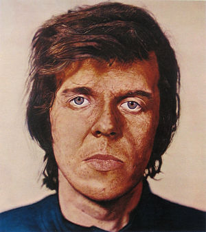
The most recent painting in the exhibition is “Kent” (1970–71) by American artist Charles (Chuck) Close. Close is unique in the art of recent years in the conviction with which he has answered the question “Has figurative art anything new to say?” He has done so, first of all, by a reversal of the usual viewer-subject relationship—instead of the voyeuristic invitation with which so many artists bait their pictures, the tables are turned, and it is we who become the subject—of the painting’s scrutiny. This is so, not only through the psychology of frontality (as used, say, in the World War I poster of Lord Kitchener) but also from the way the Brobdingnagian scale of his image (it is eight feet four inches high) identifies the pits and craters of our own face. In a movie made in 1970, the artist uses a close-up lens to scan the surface of the face of the sitter for his portrait “Budd.” The camera pans across the subject in bands no more than an inch high and, presented with the movie untitled, the fact that we are scrutinizing a face becomes clear only inductively about a third of the way through. Something similar can happen in front of this painting: because of the colossal scale of the image, we only grasp it as a whole by standing far back from it. As we close in, there comes a point at which the totality disappears and, with it, all intimations of illusionist space; and we see merely an inflected surface which we scan for clues. What Close does have in common with many figurative artists of today, of course, is the impersonality of his handling—which, however, he takes to far greater extremes than they. A work by Close seems more the result of chemical than of mechanical or human action—even though it requires consummate skill and infinite, obsessive patience (the present painting, his first in colour, took five months). Close’s method is borrowed from the colotype process. He starts by selecting a photo-transparency from which unscreened colour separations are made: one for each of the primary colours. The canvas is prepared with twelve coats of hand-sanded liquitex gesso, and the separations are used as guides for transferring to the canvas first the red, then the blue and finally the yellow component of the coloured image. After the application of each hue, a protective coat of pure acrylic medium is placed over it so that the next can be superimposed and, if necessary, erased, without damaging the work beneath. The total chromatic effect is derived from the overlay of these glazes, as it is in the colotype printing process. Close applies colour with both brush and air-brush and makes subtractive marks with razor blades, erasers and other tools—techniques which produce a glowing subtlety, lost from art since the introduction of direct painting and so-called “optical” mixing by the Impressionists, and now returned in new dimensions derived from the most recent ‘seventies paint technology.
The last exhibition gallery, in contrast to the rest, contains sculptures that seem to have in common a sort of enigmatic presence. However, they spring from quite different concerns. The strange, pseudo-machine housing which seems to be represented in Eduardo Paolozzi’s “Ovemk” reaches back to the surrealist roots from which spring an older generation of British sculptors headed by Henry Moore; but on the other hand it evokes the technological fantasy which in various forms has been Paolozzi’s contribution to “pop” art (it might have been deposited by some battered humanoid from his work of the early fifties). At the same time, however, it must be seen as a comment on the rangy, space-probing sculpture so popular in Britain in 1967 when it was made.
(131" X 168")
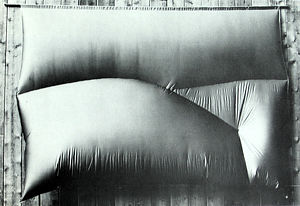
lain Baxter, who goes under the punning sobriquet of N.E. Thing Company (also associated with his wife Ingrid), has intruded into the scene of both art and commerce with a series of satirical gestures and serio-comic objects and performances, so that the average observer is hard put to know whether he is a reforming idealist or an “operator” (the confusion seems deliberate). The N.E. Thing Company (whose work is represented in the print collection by “Bagged Day-Glo Oranges”) produced vacuum-formed and inflatable art objects (“still-lifes” and “landscapes”) like the work shown here, as some of its earlier products. More recently, however, it has turned to producing, instead of such objects, documents relating to pseudo but seriously considered “business” activities, or to appearing as a strange, mildly surreal presence at business conventions [see a photo in the “49th Parallels” essay]. This sometimes seems like an executive’s version of Europe’s New Realism—a mouvement de scandale which has fallen apart since the death of its leading artist Yves Klein (who had painted a number of blue monochrome works in 1957). The aesthetic of the N.E. Thing Company’s “Inflated Blue Sky” reminds one of those works, which Klein related to the “Azur” of Mallarmé’s famous poem, and which Lawrence Alloway, former Curator of the Guggenheim Museum, compared to lumps of sky that might have fallen on Chicken Little! Had Chicken Little known of Baxter’s inflatable pie in the sky aesthetic, one supposes he would have felt more serene.
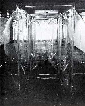
Les Levine and lain Baxter were experimenting with vacuum-formed art at about the same time, but where Baxter’s activity produced a parody of fine art, Levine’s aimed to transcend it—reaching out towards the new possibilities that technology had created. In “Mini-star,” however, Levine created at the same time one of his earliest works of disorientation: when we step inside it, our sense of space is disturbed because we are not able to focus on the walls, and as we reach out for tactile confirmation of our visual judgment we become aware (because the walls are transparent) that we are not only viewers of the piece but part of a work which others are viewing—we have stepped into Levine’s limelight and have become a “mini-star.” Since “Mini-star,” Levine has produced a whole corpus of works which have turned the tables even more disconcertingly, not only on the viewer but on dealers, curators and artists themselves. [see illustration in 49th Parallels essay]
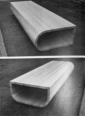
David Rabinowitch confounds our senses for a different end. “Open Pine Piece” is one of a series of sculptures in which he has created distortions of form that, although apparently simple, are so carefully judged that perception alone cannot grasp them, and we are forced against our will, as it were, to hold a purely intellectual concept of their function. Rabinowitch, who in some of these works used highly specialized technology to create a regular distortion of cross-sections of aluminum pipes (over a length sometimes as much as forty feet), attempts here to obtain a form impossible to shape except by the techniques of the shipwright, and the work was in fact constructed by one of the few remaining masters of this craft in London, Ontario. “Open Pine Piece” is the result of a penetrating and independent mind, perhaps the most ambitious and successful vanguard work to have been produced in Canada in its year.
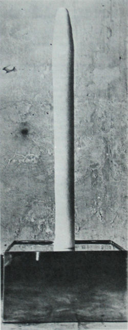
The remaining work in the exhibition also utilizes modern technology, being one of the few art works in existence which depends on refrigeration engineering. “Ice Stick,” by Hans Haacke, stands at a seminal point in the development of “post-minimal” art. Haacke came to the United States on a Fulbright Scholarship in 1961 from Germany, where he had been in contact with electrically or mechanically motivated kinetic art. In the U.S. in contrast, he turned to the creation of an art of natural kinesis – of which the sources of change were to derive from the physical conditions of the environment. From works like “Condensation Floor” of 1963 (a shallow Plexiglas box containing a layer of water and seen in the exhibition “New Alchemy” at the Art Gallery of Ontario in the fall of 1969), it was not a great step to Haacke’s use of the outside environment as his canvas, and in an attitude similar to that of several “earth” artists (not represented in the AGO collection), he made works by, as it were, inserting an “irritant” into the local environment and nominating the accretions that resulted as art (one spectacular piece involved the accretion of ice on a rope stretched across the falls at Ithaca in New York State). The present work has its place in this series. “Ice Stick” is based on a copper element which contains a refrigeration unit that causes moisture in the environment to turn to ice on contact with it. The work thus builds up until the ice becomes so thick that the effect of the unit is entirely countered, at which point the moisture no longer freezes and the surface of the ice melts -- until once more the effect of the internal element is felt and surface ice forms again, and so on. The work will continue indefinitely in this state of oscillating equilibrium—a visual and tactile and somewhat phallic delight, whose function as a hydrostatic index seems to have prompted Haacke to move later work out of the realm of objects into the investigation of purely conceptual aspects of environment: researching, and presenting us with maps and statistics that reveal sub-systems we are seldom aware of, such as,for instance, the structure of political influence - an activity which produces art high in “relevance” and mental challenge but low in tangibility (the maps and data sheets he makes available to us in this way are not to be regarded as “art” in themselves, but as cues to our accepting as “art” the systems they expose).
In this last respect Haacke relates to a number of artists represented in the graphics section supplementary to the exhibition. I have referred in the opening paragraphs of these notes to the ironic shift in identity that can result when maps take on a greater reality than the locations they represent. This tendency in respect to art writing and art works certainly seems to have been a factor leading artists to become cartographers themselves—or at least to mix the two activities, as do works in the graphics section by Bill Vazan, Gerald Ferguson, Dan Graham and Vito Acconci. Related to these in different ways, we also find in this section works by Pat Kelly, Joyce Wieland and Richards Jarden. The works of Acconci and Jarden and, in this special case, that of Wieland, may be referred to also as “body art”—that is to say, art where the body is used as the location of the work or the subject of it, or in the case of Wieland and Acconci, the tool that creates it. More importantly, considering lithography as a stamping and transferring process, the Wieland and the Kelly lithographs gain a unique concentration and power, somewhat like the sculpture of Serra, by presenting us with the method or “process” of execution, as an end. Kelly, in “Shot in the Dark” (1971), prints a simple red cross and then attempts to imprint a blue one directly over the red without the aid of registration marks—thus the ostensible aim (a mauve cross) remains unrealized, except by chance, and Kelly thereby underscores the actual aim (the “reification” of a process). Wieland’s lithograph, “0 Canada,” has the same quality of reification, since the artist “stamps” the stone with her own mouth (each lip print representing a syllable of the first stanza of the National Anthem), by which decision she links the work to her early “pop” art as well as to “body art”, and at the same time makes an engaging melange of her major themes: erotic and patriotic love.
This lithograph of Wieland’s is a candidate for the most brilliantly conceived Canadian print of the year. In this respect, however, it must be pointed out that the graphics collection has not been built on a principle of buying great prints to the exclusion of representative prints. With the Gallery’s budgetary inability to build a more widely representative collection of painting and sculpture, it has seemed important at least to fill the gaps with representative prints by artists established in more ambitious media. Examples from this shadow collection are to be found in various works in the graphics section of the exhibition, where, besides the works already mentioned, the visitor will notice a further extension of the use of photographs. For instance, where Acconci, Jarden, Greiger, Snow and Flanagan use photography for its deadpan matter-of-factness, others like Morley, Hamilton, Rot, Milow and Clem Clarke are more concerned to bring about its reconciliation with painting (not just to use advanced photo-technology as a point of departure, as with Close). Hence they use pigments and other devices to modify the photo-image in a “painterly” way, bringing out qualities of mystery and surprise that are latent in a medium so long and so conscientiously rejected by “fine” art and rehabilitated now as a sequel to “pop.”
FOOTNOTES
- See: Zacks, Ayala, at al: “Public Attitudes Towards Modern Art,” Museum, Vol. 22, Nos. 3 and 4 (UNESCO, 1970).
- A closely reasoned case for this point of view can be found in: Peckham, Morse: Man’s Rage for Chaos—Biology, Behaviour and the Arts (New York, Schocken Books, 1967).
- The recent de-emphasizing of the art object and its substitution by literary or photographic documents which travel through the mail, has released some art at least from the confines of any single location. Recently, too, the affluence of Germany has brought about a great deal of transatlantic movement of vanguard art (and of artists normally resident in New York). As the media follow this traffic, they will inevitably discover new talent at the end of the line and, at the same time, some of the awesomeness of New York will evaporate. The star system, endemic to the commercialism of the present situation, is unlikely to cease, of course, but it may be curbed and might at least continue on a more cosmopolitan scale.
- The exhibition represents only works acquired by the Art Gallery of Ontario in the last five years, but even so space has precluded the installing of a number of major acquisitions.
- Quoted in New York Times, March 10, 1967 (section 2). However, although the concept of an art which is neither painting nor sculpture is important for understanding much work in the exhibition, it has been felt best to revert in this essay to those increasingly redundant terms rather than to coin neologisms.
- LeWitt, Sol: “Paragraphs on Conceptual Art,” in Sol LeWitt, catalogue of a one-man exhibition at the Haags Gemeentemuseum (The Hague, 1970).
- Mistakenly called “Timber Piece” in the catalogue to Andre’s 1970 one-man exhibition at The Solomon R. Guggenheim Museum, New York.
- “Andre: Artist of Transportation,” The Aspen Times, July 18, 1968 (interviewed by Dodie Gust).
- An obvious influence on Alan Saret, and indeed on other artists in the exhibition, is the American Robert Morris (who is not represented in the Art Gallery of Ontario).
- Cage, John: “On Robert Rauschenberg, Artist, and his Work,” in Robert Rauschenberg, catalogue of a one-man exhibition at The Whitechapel Gallery, London (1964).